We’ve all experienced that moment of staring at our bathroom walls wondering why they feel so bland and uninspiring. The truth is your bathroom’s color scheme has incredible power to transform this essential space from purely functional to genuinely beautiful.
Choosing the right bathroom colors isn’t just about aesthetics – it’s about creating a sanctuary where you start and end each day feeling refreshed. Whether you’re drawn to calming spa-like neutrals that promote relaxation or bold statement colors that energize your morning routine we’ll help you discover the perfect palette for your space.
From classic whites that make small bathrooms feel larger to dramatic dark hues that add luxury and sophistication the possibilities are endless. We’ll explore proven color combinations that work beautifully in bathrooms of all sizes and show you how strategic color choices can address common challenges like poor lighting or awkward layouts.
Classic Neutral Bathroom Color Ideas That Never Go Out of Style
Neutral colors form the foundation of enduring bathroom design, offering versatility that adapts to changing trends while maintaining sophisticated appeal. We’ve curated the most reliable neutral palettes that deliver consistent results across different bathroom sizes and styles.
Timeless White and Off-White Palettes
Pure white creates an instantly clean and spacious feeling that makes even the smallest bathrooms appear larger. We recommend pairing crisp white walls with white subway tiles and chrome fixtures for a classic look that’s worked beautifully for decades. Off white variations like ivory, cream white, and pearl white add subtle warmth while maintaining the fresh, airy atmosphere.
Layering different white tones prevents the monochromatic look from appearing flat or sterile. Combine bright white walls with off white cabinetry and warm white trim to create visual depth. We’ve seen stunning results when designers incorporate textured white elements like beadboard wainscoting or white marble countertops.
White palettes reflect natural light exceptionally well, making them perfect for bathrooms with limited windows. Glossy white tiles on walls bounce light around the room, while matte white paint on ceilings prevents harsh glare. We suggest adding white or clear glass shower doors to maximize the light reflecting benefits throughout the space.
Sophisticated Gray and Charcoal Schemes
Light gray walls provide a contemporary alternative to white while offering the same space improving qualities. We’ve found that cool grays like dove gray and silver work particularly well in modern bathrooms with sleek fixtures and clean lines. These shades pair beautifully with white trim and stainless steel hardware.
Medium gray tones create a cozy yet refined atmosphere that works across traditional and contemporary styles. Charcoal gray makes an excellent accent color for vanities or feature walls, adding depth without overwhelming the space. We recommend balancing darker grays with plenty of white elements to prevent the room from feeling too enclosed.
Warm grays with beige undertones bridge the gap between cool and warm neutrals, making them incredibly versatile for different lighting conditions. Greige colors adapt well to both natural and artificial light, maintaining their appeal throughout the day. We’ve successfully used these shades in bathrooms facing north where cooler light might make pure grays appear too stark.
Warm Beige and Cream Combinations
Beige creates an inherently welcoming and comfortable environment that feels both classic and current. We recommend soft beige walls with cream colored cabinetry for a monochromatic look that’s sophisticated yet approachable. These warm neutrals work exceptionally well with brass or gold fixtures, creating a luxurious feeling.
Cream colors offer richness and warmth without being overpowering, making them ideal for master bathrooms where relaxation is the primary goal. We’ve paired cream walls with white trim and natural stone countertops for an elegant, spa like atmosphere. Cream also complements wood vanities beautifully, whether they’re light oak or rich walnut.
Combining different beige and cream tones creates visual interest through subtle contrast. We suggest using lighter cream shades on walls and deeper beige tones for larger elements like vanities or tile work. This approach maintains the cohesive neutral palette while adding the depth that prevents the space from appearing one dimensional.
Bold and Dramatic Bathroom Color Ideas for Statement-Making Spaces

We’re seeing bold bathroom colors become increasingly popular as homeowners embrace statement-making spaces that defy traditional design rules.
Deep Navy and Midnight Blue Themes
Deep navy transformations create striking backdrops that evoke luxury and sophistication in any bathroom space. We recommend pairing these rich blues with metallic gold or brass fixtures to enhance the elegant atmosphere. Midnight blue themes work exceptionally well for both wall applications and cabinetry installations, providing remarkable versatility in design approaches.
Navy color schemes adapt beautifully to modern or traditional décor styles, making them an excellent choice for homeowners seeking flexibility. We’ve observed that these deep blue tones create an intimate, spa-like environment that promotes relaxation while maintaining visual drama.
Rich Black and Charcoal Accent Walls
Black accent walls inject immediate drama and modernity into bathroom spaces without overwhelming the entire room. We suggest balancing these bold charcoal tones with neutral elements such as white marble, natural wood, or crisp white fixtures to maintain visual harmony.
Charcoal applications work particularly well in minimalist or industrial design styles, creating sophisticated contrast against lighter elements. We find that smaller bathrooms benefit greatly from strategic black placement on one feature wall or in cabinetry, as this approach makes compact spaces feel more intimate and stylish rather than cramped.
Jewel-Toned Emerald and Sapphire Designs
Emerald green delivers vibrant, high-end aesthetics while maintaining the calm and relaxation essential for bathroom environments. We particularly recommend emerald applications in larger bathrooms where the color’s depth and richness can be fully appreciated and celebrated.
Sapphire blue creates refreshing, cool atmospheres that energize morning routines while providing evening tranquility. We suggest pairing these jewel tones with gold or brass hardware for touches of opulence, or combining sapphire with white, gray, or wood accents to achieve serene yet bold visual effects.
Soft and Serene Bathroom Color Ideas for Relaxation

Moving beyond dramatic statements, we explore color palettes that transform your bathroom into a tranquil retreat. These gentle hues create the perfect foundation for unwinding after long days.
Calming Spa-Inspired Blue and Green Hues
Blue tones offer scientifically proven stress-reducing effects that make them ideal for bathroom relaxation spaces. Light blue shades are associated with tranquility and lowered heart rate, creating an immediate sense of calm when you enter the room. Soft green hues evoke natural elements like water and foliage, contributing to a peaceful ambiance that mimics outdoor serenity.
Deeper blues such as navy introduce sophistication while maintaining their soothing properties. These richer tones work exceptionally well as accent walls paired with crisp white fixtures and natural wood vanities. Sage green brings a grounded, earthy element that creates harmony and balance throughout the space.
Water-inspired color combinations enhance the cleanliness factor that’s essential in bathroom design. Pairing light blues with soft whites creates a fresh, spa-like atmosphere that feels both modern and timeless. Green tones mixed with neutral beiges offer a nature-inspired palette that promotes restoration and well-being.
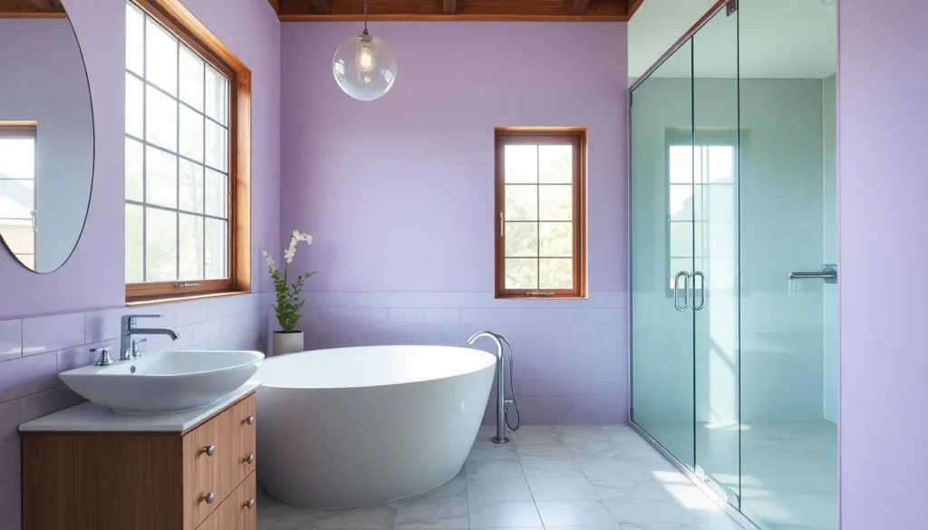
Gentle Lavender and Soft Purple Tones
Lavender promotes relaxation and mindfulness through its unique blend of blue’s tranquility and purple’s subtle vibrancy. Muted lavender works particularly well as an accent color on feature walls or through decorative elements like towels and artwork. This color choice softens the overall mood of your bathroom space without overwhelming the senses.
Soft purple tones create a sophisticated alternative to traditional neutral palettes. These gentle hues pair beautifully with white fixtures and metallic accents, adding just enough color to create visual interest. Purple’s calming properties make it an excellent choice for master bathrooms where relaxation is the primary goal.
Accent applications of lavender maximize its soothing benefits without dominating the space. Consider incorporating these tones through tile borders, shower curtains, or painted vanity cabinets to achieve the perfect balance of color and serenity.
Peaceful Sage and Mint Color Schemes
Sage green brings refreshing and restorative qualities that are inspired by nature’s most calming elements. This earthy tone creates a grounded foundation that works beautifully in both modern and traditional bathroom styles. Sage’s versatility allows it to pair seamlessly with white trim and natural wood accents for an organic, spa-inspired retreat.
Mint offers a lighter, airier feel that’s particularly beneficial for smaller bathroom spaces. This cheerful yet calm color reflects light effectively, making compact areas feel more spacious and inviting. Mint’s fresh quality creates an uplifting atmosphere that energizes morning routines while maintaining tranquility.
Natural accent combinations enhance the organic appeal of green-based color schemes. Pairing sage or mint with white fixtures and wood elements creates a cohesive look that brings the outdoors inside. These nature-inspired palettes support both relaxation and well-being, making them perfect choices for creating your personal bathroom sanctuary.
Warm and Cozy Bathroom Color Ideas That Create Comfort

After exploring cooler tones and bold statements, we’re turning to the colors that truly embrace you with warmth and comfort. These inviting bathroom color palettes transform your space into a personal sanctuary where relaxation comes naturally.
Earthy Terracotta and Rust Orange Palettes
Terracotta brings the warmth of sun-baked clay directly into your bathroom space. We love how these earthy tones create an instantly inviting atmosphere that feels both grounded and sophisticated. Rust orange adds depth to this palette while maintaining that cozy, natural appeal that makes every bath feel like a retreat.
Natural stone accents pair beautifully with terracotta walls, creating texture that enhances the earthy aesthetic. Wooden vanities in warm oak or walnut tones complement these colors perfectly, adding organic elements that reinforce the natural warmth. Consider using terracotta as an accent wall behind your vanity or in shower alcoves to create focal points without overwhelming the space.
These warm earth tones work exceptionally well in bathrooms with limited natural light, as they create their own sense of warmth and brightness. Brass fixtures and hardware enhance the golden undertones in rust orange, while matte black accents provide striking contrast that keeps the palette from feeling too monochromatic.
Rich Burgundy and Wine Red Accents
Burgundy transforms any bathroom into a luxurious retreat with its deep, sophisticated appeal. We recommend using wine red as strategic accents rather than dominant colors to maintain balance while adding dramatic warmth. These rich tones create depth and visual interest when paired thoughtfully with neutral backgrounds.
Gold fixtures become stunning focal points against burgundy walls, creating an elegant contrast that feels both classic and contemporary. Brass hardware enhances the warm undertones in wine red, while copper accents add an extra layer of richness that complements the deep color palette. Consider painting lower cabinets in burgundy while keeping upper elements neutral for a balanced approach.
Wine red works particularly well in powder rooms where you can embrace bold color without worrying about overwhelming a larger space. These colors pair beautifully with cream or warm white trim, creating a sophisticated contrast that highlights architectural details. Natural wood elements in cherry or mahogany tones enhance the warmth while maintaining the luxurious atmosphere.
Golden Yellow and Honey-Toned Combinations
Golden yellow brings sunshine into your bathroom regardless of the weather outside. We find that honey tones create an uplifting atmosphere that energizes morning routines while maintaining the cozy warmth perfect for evening relaxation. These bright yet warm colors work especially well in bathrooms that need a cheerful boost.
Soft whites and cream colors provide the perfect backdrop for golden accents, allowing the warm tones to shine without becoming overwhelming. Consider using honey yellow on a single accent wall or in tile work to add color without dominating the entire space. These combinations create visual interest while maintaining a cohesive, welcoming environment.
Natural materials like bamboo and light wood enhance golden bathroom palettes by adding texture and reinforcing the warm, organic feel. Brushed gold or brass fixtures complement these colors beautifully, creating a coordinated look that feels intentional and sophisticated. The brightness of golden yellow makes smaller bathrooms feel more spacious while the warmth keeps larger spaces feeling intimate and cozy.
Modern Monochromatic Bathroom Color Ideas for Sleek Design

Monochromatic bathroom designs create unified, sophisticated spaces that emphasize texture and subtle accents for visual depth. These single-color approaches offer contemporary elegance while maintaining design simplicity.
All-Black Contemporary Aesthetics
All-black bathrooms deliver bold drama and sophisticated atmosphere through carefully balanced design elements. Matte black fixtures paired with black subway tiles create a cohesive foundation that exudes modern luxury. Dark cabinetry enhances the contemporary aesthetic while maintaining functionality throughout the space.
Wood accents provide essential warmth that prevents the space from feeling too enclosed or oppressive. Gold or brass hardware introduces metallic contrast that elevates the overall design sophistication. Ample lighting becomes crucial in these spaces to balance the darkness and create inviting ambiance.
Texture plays a vital role in preventing monotony within all-black schemes. Different finishes like matte tiles, glossy fixtures, and natural wood create visual interest without disrupting the color unity. Strategic placement of mirrors amplifies light reflection and creates the illusion of expanded space.
Pure White Minimalist Approaches
Pure white bathrooms exemplify timeless elegance through crisp, clean aesthetics that create bright, airy environments. White walls combined with white tiles and fixtures establish a foundation of minimalist sophistication. Bright, open spaces result from this monochromatic approach that maximizes natural light reflection.
Textural elements add essential depth without compromising the minimalist theme. Subway tiles provide classic appeal while marble surfaces introduce luxury and visual interest. Shiplap walls create subtle texture that enhances the overall design without overwhelming the space.
Metallic accents in chrome or nickel deliver modern luxury touches that complement the white palette. Soft textiles and subtle patterns can be introduced sparingly to maintain visual interest. Clean lines and uncluttered surfaces reinforce the minimalist aesthetic that defines these spaces.
Single-Color Gradient Techniques
Single-color gradient techniques create visually ever-changing spaces while maintaining cohesive modern appeal. Various shades of one color transition throughout the bathroom to establish flow and movement. Pale blue ceilings transitioning to deep navy lower walls demonstrate effective gradient implementation.
Differently toned tiles offer another approach to gradient design that adds sophistication without complexity. Small bathrooms benefit from gradient techniques that create the illusion of expanded space. Visual flow increases through careful shade transitions that guide the eye naturally throughout the room.
Gradient applications work particularly well with blues, grays, and greens that offer extensive shade variations. Lighting considerations become important to ensure gradient transitions appear smooth and intentional. Texture variations within the same color family enhance the gradient effect while maintaining design unity.
Two-Tone Bathroom Color Ideas for Visual Interest

Two-tone designs create stunning visual separation by dividing walls, cabinetry, or features into distinct color zones. This approach adds depth and sophistication to any bathroom style while highlighting exact architectural elements.
High-Contrast Black and White Combinations
Classic elegance emerges when we pair crisp white with deep black for a timeless aesthetic. Matte black fixtures combined with white walls or cabinetry create dramatic yet serene environments that never go out of style.
Contemporary minimalism thrives with this high-contrast approach, especially when accented with chrome or brass hardware for refined edge details. Black tiles paired with white grout lines establish bold geometric patterns that define modern bathroom spaces.
Strategic placement of black elements prevents overwhelming the space while maintaining visual impact. We recommend using black for vanities, mirror frames, or accent walls while keeping larger surfaces white to preserve brightness and spaciousness.
Complementary Color Pairings
Vibrant energy flows from complementary colors positioned opposite each other on the color wheel, creating lively and captivating bathroom environments. Popular pairings include blue with orange undertones or green with pink accents that energize without overwhelming the senses.
Designer balance emerges when we use one color as the main wall shade and introduce the complementary tone through towels, artwork, or decorative accessories. This method keeps bathrooms visually exciting while maintaining practical functionality.
Color intensity varies based on personal preference, from soft coral and sage combinations to bold navy and burnt orange pairings. Each approach delivers unique personality while following proven color theory principles for maximum visual appeal.
Analogous Color Harmony Schemes
Soothing tranquility develops through analogous schemes using adjacent color wheel neighbors like blue-green, green, and yellow-green combinations. These harmonious palettes create spa-like environments perfect for relaxation and unwinding.
Natural flow occurs with light blues paired with soft greens or warm greys blended with beige tones for seamless color transitions. This approach mimics nature’s gentle progressions found in ocean waves or forest landscapes.
Enhanced serenity builds when we incorporate natural accents such as wood vanities or stone countertops alongside analogous color schemes. The result transforms ordinary bathrooms into peaceful retreats that promote daily wellness and restoration.
Small Bathroom Color Ideas That Maximize Space

We’ve designed these space-maximizing color strategies specifically for compact bathrooms where every visual trick counts. Strategic color choices can transform cramped quarters into airy, functional retreats.
Light and Bright Color Strategies
Light colors serve as our foundation for creating spacious-feeling small bathrooms. White, soft pastels, and light gray reflect maximum light throughout the space, instantly making walls appear to recede and ceilings seem higher. These neutral shades work particularly well when we want to maximize both natural and artificial lighting effects.
High-gloss finishes amplify our light-reflecting strategy even further. Semi-gloss sheens on walls bounce light more effectively than flat paints, contributing to that coveted airy atmosphere we’re seeking in tight spaces. Light yellow adds gentle warmth while maintaining the brightness essential for space expansion.
Coordinating light fixtures with our bright color palette ensures maximum impact. We recommend pairing these light wall colors with chrome or brushed nickel fixtures that won’t compete for visual attention but will enhance the overall luminous effect.
Mirror-Improving Reflective Tones
Mirror placement becomes exponentially more effective when we choose complementary neutral wall colors. Light, neutral tones create the perfect backdrop for reflective surfaces, allowing mirrors to bounce light seamlessly throughout the bathroom without creating harsh contrasts or visual interruptions.
Highly reflective tilework paired with neutral walls doubles our space-expanding impact. Glossy subway tiles, glass mosaics, or polished stone surfaces work in tandem with light wall colors to create continuous light reflection that visually expands the bathroom’s footprint significantly.
Strategic mirror positioning opposite windows or light sources maximizes our reflective color scheme. We position large mirrors to catch and redistribute both natural daylight and artificial lighting, creating an endless loop of brightness that makes small bathrooms feel dramatically larger.
Vertical Color Placement Techniques
Vertical stripes draw the eye upward, making our small bathroom ceilings appear significantly higher. We apply continuous color from floor to ceiling without horizontal interruptions, creating unbroken vertical lines that elongate the space and add perceived height to cramped quarters.
Painting cabinets and trim in lighter shades than wall colors creates layered visual depth. This technique establishes multiple planes of color that prevent walls from feeling flat while maintaining the light, airy atmosphere essential for small space design.
Single accent walls provide bold interest without overwhelming compact spaces. We strategically place one darker or brighter accent wall to add personality while keeping the remaining three walls in light, space-expanding colors that maintain the room’s open feeling.
Large Bathroom Color Ideas That Define Zones

Large bathrooms offer unique opportunities to create distinct functional areas through strategic color application. We can transform spacious layouts into organized, visually appealing spaces by using color to define exact zones like vanity areas, shower spaces, and bathing nooks.
Color Blocking for Separate Areas
Bold swaths of contrasting colors create clear visual boundaries between different bathroom functions. We recommend using dark accent walls behind freestanding tubs while keeping shower tiles light, making each zone distinctly identifiable. Bright color blocking energizes the space and establishes separate identities for areas like wash basins, storage zones, and bathing spaces.
Neutral backdrops in white, gray, or beige serve as unifying elements throughout the bathroom. These foundational colors allow accent hues to effectively delineate separate areas without overwhelming the overall design. Color blocking works particularly well when we pair deeper, richer tones with lighter shades to add depth and luxury to larger spaces.
Accent Wall Placement Strategies
Strategic accent wall placement draws attention to key bathroom features while creating zone separation. Positioning bold accent walls behind vanities or bathtubs establishes these areas as primary focal points within the space. Deep blues, rich greens, and jewel tones work exceptionally well for creating dramatic backdrop effects.
Accent walls effectively separate bathing areas from dressing zones, reinforcing the concept of distinct functional spaces. We suggest choosing colors that complement your overall palette while providing enough contrast to create visual interest. This technique works best when the accent color appears nowhere else in the bathroom, maintaining its impact as a defining element.
Multi-Tonal Layering Approaches
Layering multiple shades of a single color family creates depth while maintaining visual cohesion across zones. Various shades of blue or gray can enhance each area’s individuality while supporting overall bathroom harmony. This approach allows for subtle transitions between functional spaces without jarring color changes.
Complementary hues work together to establish ever-changing yet balanced color palettes throughout large bathrooms. Pairing lighter tones with dark accents prevents visual overwhelm while ensuring each zone maintains its distinct character. We recommend starting with a base neutral and adding progressively deeper or brighter variations to create natural flow between areas.
This layering technique supports flexibility in decorating and allows for easy updates without major renovations. Strategic placement of varying intensities helps guide the eye naturally through the space while maintaining sophisticated appeal.
Conclusion
We’ve explored a comprehensive range of bathroom color ideas that can transform your space into a personal oasis. Whether you’re drawn to timeless neutrals calming blues or dramatic jewel tones the key lies in selecting colors that reflect your style and enhance your daily routine.
Remember that successful bathroom color schemes balance aesthetics with functionality. Consider your space size lighting conditions and desired atmosphere when making your final decision. Small bathrooms benefit from light reflective colors while larger spaces offer flexibility for bold zoning techniques.
Your bathroom should be a sanctuary that energizes your mornings and relaxes your evenings. With these color strategies you’re equipped to create a space that’s both beautiful and perfectly suited to your lifestyle needs.
Frequently Asked Questions
What are the best neutral colors for bathroom design?
Classic neutral colors include timeless whites and off-whites that create spacious feelings, sophisticated grays and charcoals for contemporary appeal, and warm beiges and creams for welcoming environments. These versatile palettes adapt to changing trends while maintaining sophistication and can be layered with different tones to add visual depth and interest.
How can bold colors work in bathroom design?
Bold colors like deep navy and midnight blue create luxury and sophistication, especially when paired with metallic fixtures. Rich black and charcoal accent walls add modern drama when balanced with neutral elements. Jewel tones such as emerald green and sapphire blue provide vibrant aesthetics while still promoting relaxation in the space.
What colors create a calming bathroom atmosphere?
Soft blues and greens reduce stress and evoke natural elements for peaceful ambiance. Gentle lavender and soft purple tones offer relaxing properties as sophisticated alternatives to traditional neutrals. Sage and mint color schemes provide refreshing options that promote well-being, especially when paired with natural elements for spa-like environments.
Which warm colors work best in bathrooms?
Earthy terracotta and rust orange palettes bring warmth and sophistication, enhanced by natural stone and wooden accents. Rich burgundy and wine red create luxurious appeal when balanced with neutral backgrounds. Golden yellow and honey tones energize morning routines while maintaining cozy ambiance, complemented by natural materials and warm fixtures.
How do monochromatic color schemes work in bathrooms?
Monochromatic schemes create sleek, unified designs through texture and subtle accents. All-black aesthetics achieve bold drama with matte fixtures and wood accents, while proper lighting prevents monotony. Pure white minimalist approaches maximize natural light and use textural elements. Single-color gradients create visual dynamics while maintaining cohesive modern appeal.
What are effective two-tone bathroom color combinations?
High-contrast black and white combinations create classic aesthetics with balanced fixtures maintaining brightness. Complementary color pairings offer vibrant combinations that energize spaces while remaining functional. Analogous color harmony uses adjacent colors for soothing, spa-like environments enhanced by natural accents like wood and stone for added sophistication.
How should I choose colors for a small bathroom?
Light colors like white and soft pastels reflect light and create space illusions. High-gloss finishes enhance brightness while coordinated light fixtures ensure cohesive looks. Light neutral tones maximize mirror light reflection. Vertical color placement techniques, including continuous floor-to-ceiling color and strategic accent walls, create height perception in compact spaces.
What color strategies work for large bathrooms?
Large bathrooms benefit from color blocking techniques using bold contrasting colors to create visual boundaries between functional areas. Neutral backdrops unify designs while accent hues delineate zones. Strategic accent wall placement draws attention to key features. Multi-tonal layering approaches use varying shades within color families for depth and cohesion.
How do I balance dramatic colors in bathroom design?
Balance dramatic colors by pairing them with neutral elements to maintain harmony. Use proper lighting to prevent monotony in dark schemes. Incorporate textural elements and metallic accents to enhance bold color choices. Consider the bathroom size when implementing dramatic colors, using them strategically as accent features rather than overwhelming the entire space.
What role does lighting play in bathroom color selection?
Lighting significantly impacts color perception and atmosphere. Poor lighting can be overcome through strategic color choices that reflect available light. Light colors maximize brightness in spaces with limited natural light. Proper lighting prevents monotony in monochromatic schemes and enhances the visual impact of both bold and subtle color combinations throughout the bathroom.