When we think about creating the perfect living room, few color combinations deliver the same effortless elegance as gray and blue. This timeless duo strikes the ideal balance between sophistication and comfort, offering endless possibilities for both modern and traditional homes. We’ve discovered that this versatile palette works beautifully whether you’re aiming for coastal charm, contemporary chic, or classic sophistication.
The magic of gray and blue lies in their natural harmony – cool grays provide the perfect neutral foundation while various blue tones add depth and personality. From soft powder blues paired with charcoal accents to navy statements against light gray walls, we’ll explore how these colors can transform your space into a serene yet stylish retreat.
Whether you’re planning a complete room makeover or simply looking to refresh your current décor, we’ll share practical ideas that’ll help you master this stunning color combination and create a living room that’s both inviting and impressively designed.
Classic Navy and Charcoal Combinations
Navy blue and charcoal gray create the most enduring and sophisticated foundation for any living room design. This powerful combination delivers maximum visual impact while maintaining an air of refined elegance.
Traditional Furniture Pairings
Select a charcoal gray sectional as your primary seating piece to establish a strong visual anchor in the room. Charcoal upholstery provides the perfect neutral backdrop that allows navy accent pieces to truly shine. We recommend choosing furniture with clean lines and substantial proportions to match the boldness of this color scheme.
Choose navy blue accent chairs with wingback or rolled arm designs to introduce traditional sophistication. These statement pieces work beautifully when positioned across from your main seating area. Look for chairs with button tufting or nail head trim details that enhance the classic aesthetic.
Add a charcoal gray coffee table with navy blue styling elements such as decorative hardware or painted accents. Ottoman coffee tables in charcoal leather or fabric offer both functionality and visual weight. Consider pieces with storage capabilities to maintain the clean lines essential to this classic combination.
Incorporate navy blue built in bookcases or entertainment centers to create architectural interest against charcoal gray walls. These permanent fixtures add substantial visual depth while providing practical storage answers. Paint existing built ins in navy to instantly transform your space without major renovation costs.
Timeless Color Ratios
Apply the 60-30-10 rule with charcoal as your dominant color covering walls, large furniture pieces, and major textile elements. This ratio ensures charcoal gray creates a sophisticated foundation without overwhelming the space. Use this dominant color on approximately 60% of visible surfaces for optimal balance.
Distribute navy blue across 30% of your design elements including accent furniture, area rugs, and window treatments. Navy works exceptionally well on medium sized pieces like armchairs, ottomans, and decorative pillows. This secondary color ratio provides enough presence to create visual interest without competing with your charcoal foundation.
Reserve 10% for crisp white or cream accents to prevent the space from feeling too dark or heavy. White throw pillows, lamp shades, and decorative objects brighten the overall composition. These light accents create essential contrast points that make both the navy and charcoal colors appear more vibrant.
Balance warm and cool undertones by choosing charcoal with slight brown undertones paired with navy blues that lean toward purple rather than green. This subtle warmth prevents the combination from feeling cold or institutional. Test paint samples in different lighting conditions to ensure your chosen shades work harmoniously together.

Light Gray and Powder Blue Schemes

Light gray and powder blue create the perfect foundation for a serene living room that feels both sophisticated and welcoming. This gentle color pairing offers endless possibilities for creating spaces that breathe tranquility while maintaining visual interest.
Airy Coastal Vibes
Transform your living room into a coastal retreat by pairing light gray walls with powder blue and white accents. We recommend starting with light gray as your dominant color, covering about 60% of the space through paint and major furniture pieces.
Incorporate natural elements like wicker furniture and jute rugs to enhance the coastal atmosphere. A light gray sectional paired with powder blue throw pillows instantly evokes seaside relaxation, while wicker accent chairs add organic texture.
Maximize natural light with sheer curtains in crisp white or soft cream tones. Driftwood coffee tables and weathered wood side tables complete the coastal look while maintaining the light gray and powder blue color story.
Layer different textures through linen curtains, rope details, and sea glass accessories. These elements work together to create depth while keeping the overall palette light and airy.
Scandinavian Minimalist Approach
Focus on monochromatic grays and blues using different shades to create visual depth without overwhelming the space. We suggest selecting three to four tones within the gray and blue families for a cohesive Scandinavian look.
Choose minimalist furniture pieces like sleek sofas in light gray paired with powder blue accent chairs. Clean lines and simple silhouettes are essential for achieving the Scandinavian aesthetic while maintaining color harmony.
Add natural textiles like wool rugs and linen upholstery to bring warmth and texture to the minimalist space. These materials soften the cool color palette while staying true to Scandinavian design principles.
Enhance the scheme with metallic accents in silver or brushed nickel rather than gold. These cooler metals complement the gray and blue palette while adding subtle sophistication to the minimalist design.


Bold Cobalt and Slate Accent Walls

Creating a striking focal point with cobalt blue and slate gray transforms any living room into a sophisticated space. These contrasting colors work together to establish visual depth while maintaining elegant balance.
Statement Wall Techniques
Accent wall painting creates the most dramatic impact when we choose one wall for bold cobalt blue treatment. The remaining walls should feature slate gray to provide a calming backdrop that prevents visual overwhelm. Paint techniques like color blocking can define different zones within the room while maintaining cohesive flow.
Wallpaper applications offer texture and pattern opportunities that plain paint cannot achieve. Blue grasscloth wallpaper adds natural texture while classic navy and white stripes create timeless appeal. We recommend applying patterned wallpaper to just one accent wall to avoid visual competition with furniture and decor.
Two tone combinations maximize the impact of both colors without overwhelming the space. Use cobalt blue on the lower two thirds of walls with slate gray above, separated by white chair rail molding. This technique draws the eye upward while grounding the room with deeper color at the base.
Balancing Bright and Neutral Tones
Color distribution follows design principles that ensure neither shade dominates the space inappropriately. Slate gray should cover approximately 60% of wall surfaces while cobalt blue accents comprise 30% of the visual weight. The remaining 10% consists of white or cream elements that brighten the overall palette.
Furniture selection plays a crucial role in maintaining color harmony throughout the room. Gray sectional sofas and coffee tables provide neutral anchoring points while cobalt blue accent chairs add vibrant personality. Throw pillows and artwork can bridge both colors to create seamless transitions between bold and neutral elements.
Metallic accents enhance the sophisticated appeal of this color combination without competing for attention. Gold picture frames and brass table lamps complement both cobalt and slate tones while adding warmth. Silver or chrome accessories work equally well for spaces that lean toward contemporary styling preferences.


Textural Gray and Blue Elements

We’ve found that incorporating diverse textures transforms a gray and blue living room from simple to sophisticated. The key lies in selecting materials that complement each color while adding visual depth through tactile elements.
Woolen rugs anchor our living spaces with natural warmth and texture, whether we choose deep charcoal gray or ocean blue tones. These foundational pieces provide comfort underfoot while establishing the room’s color story from the ground up.
Velvet sofas in navy blue create an instant focal point that invites touch and relaxation. The plush fabric catches light beautifully throughout the day, shifting from deep midnight tones in evening lighting to rich sapphire hues in natural daylight.
Cotton throws and linen cushions layer effortlessly across seating areas, allowing us to mix various shades of gray and blue while introducing different fabric weights. We recommend combining smooth cotton textures with nubby linen weaves for maximum visual interest.
Wool blankets draped over chair arms or sofa backs add both functionality and style, particularly when we select pieces with subtle geometric patterns or tonal variations within the gray and blue spectrum.
Layered Fabric Combinations
Patterned pillows featuring gray backgrounds with blue motifs create sophisticated focal points without overwhelming our color scheme. We’ve discovered that florals, geometrics, and abstract designs work equally well when they maintain our established palette.
Striped upholstery combines both colors seamlessly, whether we choose wide bands for bold statements or narrow pinstripes for subtle sophistication. These patterns work particularly well on accent chairs or ottomans where they won’t compete with larger furniture pieces.
Textural contrasts emerge when we pair smooth silk cushions with rough jute fabrics or glossy leather with matte cotton. These combinations create visual tension that keeps our eyes engaged while maintaining color harmony.
Neutral accents in cream and ivory prevent our gray and blue combinations from feeling too monochromatic. We strategically place these lighter elements to brighten corners and create breathing space within our layered textile story.
Mixed Material Finishes
Wooden furniture brings organic warmth that balances the coolness of our gray and blue palette. Natural oak tables and walnut shelving create beautiful contrast against painted walls while maintaining the room’s sophisticated atmosphere.
Metallic accents in brushed silver and antique brass elevate our design beyond basic color coordination. Table lamps with silver bases, brass picture frames, and copper decorative objects add shimmer without overwhelming our established scheme.
Glass surfaces on coffee tables and side tables reflect our carefully chosen colors while maintaining visual lightness. These transparent elements prevent our rooms from feeling too heavy while showcasing beautiful rugs and textiles beneath.
Marble elements introduce luxury through veined patterns that naturally incorporate both gray and blue tones. Console tables, lamp bases, and decorative bowls in Carrara or blue marble create stunning focal points that feel both classic and contemporary.


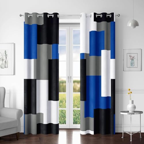
Modern Geometric Patterns and Prints

Geometric patterns transform gray and blue living rooms by adding structured visual interest while maintaining the sophisticated color harmony we’ve established. These contemporary design elements create ever-changing focal points that complement the textural foundations we’ve already discussed.
Contemporary Rug Designs
Moroccan inspired rugs anchor your gray and blue living room with geometric patterns that blend traditional motifs with modern aesthetics. We recommend selecting rugs featuring diamond shapes, hexagonal patterns, or quatrefoil designs in varying shades of gray and blue to create visual depth beneath your furniture arrangement.
Abstract rugs featuring swirling patterns offer a softer approach to geometric design while maintaining the sophisticated color palette. These contemporary pieces work particularly well with the marble elements and mixed material finishes we’ve explored, as their fluid patterns create movement that balances structured furniture lines.
Chevron and zigzag patterns in area rugs add energetic geometric interest without overwhelming your established 60-30-10 color distribution. Position these ever-changing rugs strategically to draw attention to seating areas while reinforcing the cobalt blue and slate gray accent walls we’ve discussed.
Grid and lattice designs provide subtle geometric structure that complements the woolen textures and velvet surfaces in your space. These patterns work especially well in lighter gray and powder blue combinations, creating visual organization without competing with patterned pillows or striped upholstery elements.
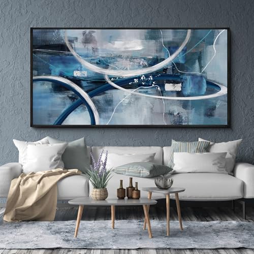
Abstract Artwork Integration
Abstract wall art featuring blues and grays creates cohesive focal points that enhance the sophisticated appeal of your geometric rug choices. We suggest selecting pieces with flowing brushstrokes or color blocking techniques that echo the swirling patterns in your contemporary rugs while maintaining the established color harmony.
Mixed media art pieces combine paint, fabric, and textural materials in gray and blue hues to add dimensional interest above your navy velvet sofas or charcoal gray sectionals. These contemporary works bridge the gap between your textile layers and architectural elements, creating visual connections throughout the room.
Geometric abstract paintings featuring angular shapes, triangular compositions, or circular patterns reinforce the structured design elements in your rug selections. Position these artworks strategically to complement your accent walls while maintaining balance with the metallic accents and glass surfaces we’ve incorporated.
Large scale abstract prints create dramatic statements that work harmoniously with your Moroccan inspired rugs and contemporary furniture arrangements. These oversized pieces draw the eye upward, improving the room’s vertical space while maintaining the serene yet sophisticated atmosphere of your gray and blue palette.


Vintage-Inspired Blue and Gray Decor

Building on contemporary design foundations, we can transform our living spaces by incorporating vintage elements that celebrate the timeless appeal of blue and gray color schemes. This approach creates nostalgic charm while maintaining the sophisticated elegance we’ve established.
Antique Furniture Pieces
Selecting vintage armchairs becomes our first priority when creating an authentic retro atmosphere. We should look for pieces with original upholstery in faded blues or weathered grays, as these naturally aged tones complement our color palette perfectly. Distressed wooden tables serve as excellent focal points, particularly those with painted finishes in soft gray or chippy blue paint.
Finding authentic mid-century modern pieces elevates our vintage-inspired design significantly. We can incorporate Danish modern credenzas in teak wood, which provide warm contrast against cool blue and gray tones. Vintage buffets with original hardware create both storage answers and display opportunities for our curated accessories.
Mixing different eras of antique furniture creates visual depth and storytelling appeal. We might combine a Victorian settee reupholstered in powder blue velvet with a 1950s coffee table featuring hairpin legs. This layered approach prevents our space from looking like a museum display while maintaining authentic vintage character.
Retro Color Palettes
Classic powder blue forms the foundation of our vintage color scheme, offering timeless appeal. This soft, muted shade works beautifully on accent walls or as the primary color for vintage furniture pieces. We can pair it with light gray undertones to create the gentle contrast that defined mid-century design aesthetics.
Cerulean blue adds vibrancy without overwhelming our vintage-inspired palette. This iconic retro shade appears frequently in 1940s and 1950s design schemes, making it perfect for accent pillows, artwork, or ceramic accessories. We should use it sparingly to maintain the sophisticated balance we’ve established.
Soft grays provide the neutral backdrop that vintage rooms require for proper color distribution. Dove gray and pearl gray shades create calming foundations that allow our blue accents to shine. These neutral tones also help vintage furniture pieces stand out as focal points rather than competing with busy backgrounds.
Navy blue accents ground our retro palette while adding necessary depth and contrast. We can incorporate this deeper tone through vintage-inspired lighting fixtures, picture frames, or throw blankets. This creates the classic color hierarchy that makes vintage rooms feel cohesive and intentionally designed.


Monochromatic Gray Base with Blue Pops

Building on our vintage inspirations, we can create a sophisticated foundation using monochromatic gray tones that allow blue accents to truly shine. This approach provides versatility while maintaining the elegant balance we’ve established throughout our design journey.
Strategic Accent Placement
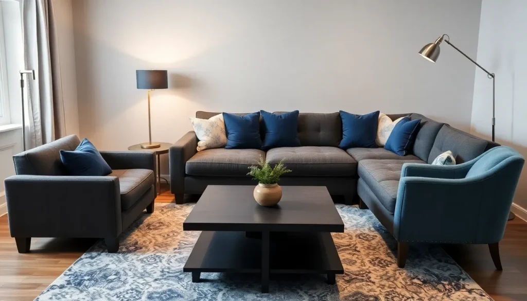
Navy blue sectional sofas serve as powerful focal points when positioned against light gray walls, creating immediate visual impact without overwhelming the space. We recommend incorporating navy blue accent pieces such as ceramic vases, picture frames, and decorative bowls to establish consistent color distribution throughout the room.
Throw pillows in various blue tones work exceptionally well when layered on gray furniture, allowing us to experiment with different shades from powder blue to deep navy. Statement furniture pieces like a navy blue armchair or ottoman can anchor the room while maintaining the monochromatic gray foundation.
Various gray tones help balance bold blue accents by providing neutral transitions between colors, preventing any single element from dominating the visual hierarchy. We suggest using charcoal gray side tables or light gray area rugs to create these harmonious connections.
| Blue Accent Placement | Gray Balance Elements | Visual Impact |
|---|---|---|
| Navy sectional sofa | Light gray walls | High contrast focal point |
| Blue throw pillows | Gray furniture base | Layered texture interest |
| Navy accent chair | Charcoal side tables | Balanced color distribution |
| Blue decorative vases | Light gray area rugs | Cohesive flow |
Seasonal Color Swapping
Seasonal themes allow us to refresh our gray and blue foundation without major renovations, simply by introducing complementary accent colors that enhance the existing palette. During winter months, we can add warm beige throw blankets or golden metallic picture frames to create cozy contrast against the cool gray and blue base.
Spring updates might include sage green plants or soft yellow accent pillows that complement the established color scheme while bringing fresh energy to the space. Summer transformations work beautifully with white or cream decorative elements that brighten the monochromatic gray foundation.
Decorative items like area rugs, throw blankets, and ceramic accessories provide the easiest swap opportunities since they require minimal effort but deliver maximum visual impact. We’ve found that changing these elements seasonally keeps the room feeling current while preserving our carefully planned gray and blue color story.
Autumn brings opportunities to introduce rich burgundy or deep orange accents through candles, artwork, or seasonal floral arrangements that create warm contrast against the cool foundational palette.
Two-Tone Furniture and Built-Ins

Strategic furniture selection creates stunning focal points when we combine custom storage answers with painted pieces. Built-in elements provide permanent design features while painted furniture offers affordable transformation opportunities.
Custom Cabinet Answers
Gray and blue accent cabinets deliver sophisticated storage while maintaining our established color scheme. We can design these custom pieces with gray finishes and incorporate blue hardware or interior backing for subtle contrast. Built-in shelving systems work exceptionally well when we integrate gray frames with blue accent panels or backing materials.
Entertainment centers benefit from this dual-tone approach by using charcoal gray cabinetry with navy blue interior sections. We should consider adding LED lighting behind blue-tinted glass panels to create ambient lighting effects. Corner storage units can maximize space efficiency while contributing to the room’s overall design narrative through strategic color placement.
Display cabinets showcase collections effectively when we use light gray exteriors with powder blue interior walls. This combination highlights decorative objects while maintaining visual harmony with existing furniture pieces. Built-in window seats provide additional seating and storage when upholstered in blue fabrics and paired with gray wooden frames.
Painted Furniture Projects
Existing furniture pieces gain new life through strategic blue and gray paint applications. We can transform dated coffee tables by applying gray base coats and adding blue accents through stenciled patterns or hardware updates. Chalk paint combinations create unique distressed effects when we blend blue and gray hues for vintage-inspired finishes.
Side tables respond well to gradient painting techniques that transition from light gray to deeper blue tones. We should sand furniture surfaces properly before applying primer to ensure paint adhesion and longevity. Bookshelf transformations work beautifully when we paint the frame gray and back panels in complementary blue shades.
Dining chairs can tie living spaces together when we paint them in alternating gray and blue colors. This approach creates visual rhythm while maintaining color consistency throughout adjacent rooms. We can add protective topcoats to high-use furniture pieces to preserve our painted finishes and maintain their appearance over time.
Metallic Accents in Gray and Blue Rooms

Metallic elements transform gray and blue living rooms by adding depth and visual interest to the sophisticated color palette. These shimmering details create the perfect balance between cool neutrals and warm luxury touches.
Silver and Chrome Details
Silver and chrome accents introduce a sleek contemporary look that naturally complements the cooler tones of gray and blue palettes. Chrome coffee tables serve as stunning centerpieces that reflect light throughout the space while maintaining the room’s modern aesthetic. Pendant lights with silver finishes enhance the airy feel of gray and blue rooms by bouncing natural light across walls and surfaces.
Decorative accessories in silver tones add subtle glamour without overwhelming the peaceful color scheme. Picture frames with chrome borders create cohesive gallery walls that showcase artwork while reinforcing the metallic theme. Light fixtures featuring brushed silver details elevate the space’s sophistication level and provide functional illumination that highlights both gray and blue elements.
Table lamps with chrome bases paired with white or gray lampshades maintain the cool color temperature while adding necessary task lighting. Silver decorative bowls and trays on coffee tables or side tables introduce functional metallic touches that serve both aesthetic and practical purposes.
Brass and Gold Complement Options
Brass and gold accents provide striking contrast against cool gray and blue palettes by introducing warmth and luxury elements. Gold planters become eye catching focal points when filled with greenery, creating natural balance within the structured color scheme. Picture frames in brass finishes add visual weight to wall displays while warming up the overall room temperature.
Lighting fixtures featuring brass elements bring industrial or retro vibes depending on their exact styling and finish choices. Table lamps with gold bases create intimate seating areas that feel welcoming and sophisticated. Brass cabinet hardware on built in storage answers adds functional metallic details that enhance both form and function.
Gold throw pillows with metallic threading introduce subtle shimmer that catches light throughout different times of day. Decorative accessories like brass candlesticks or gold mirrors serve as statement pieces that anchor seating arrangements. Coffee table styling benefits from brass accents through decorative objects like sculptural bowls or geometric ornaments that reinforce the luxurious metallic theme.


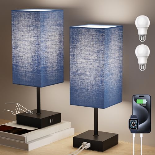
Lighting Solutions for Gray and Blue Living Rooms

Lighting becomes the secret weapon that transforms gray and blue living rooms from cold spaces into warm, inviting sanctuaries. We’ll explore how strategic lighting choices can enhance your sophisticated color palette while creating the perfect ambiance.
Warm vs Cool Light Temperatures
Warm light temperatures ranging from 2700K to 3000K emit a yellowish hue that counterbalances the naturally cool tones of gray and blue palettes. This temperature range creates a cozy, welcoming atmosphere that prevents your living room from feeling stark or unwelcoming. We recommend using warm light bulbs in your primary lighting fixtures to establish a comfortable baseline throughout the space.
Cool light temperatures between 4000K and 5000K produce a brighter, bluish white illumination that can enhance the crisp, modern aesthetic of gray and blue rooms. These temperatures work exceptionally well in task lighting scenarios, such as reading lamps or under cabinet lighting. Balancing cool lighting with warm accent pieces ensures your space maintains visual interest without becoming too clinical.
Layered lighting strategies combine both warm and cool temperatures strategically throughout your gray and blue living room. We suggest using warm ambient lighting for general illumination, cool task lighting for functional areas, and warm accent lighting to highlight architectural features or artwork. This approach creates depth and prevents your color scheme from appearing one dimensional.
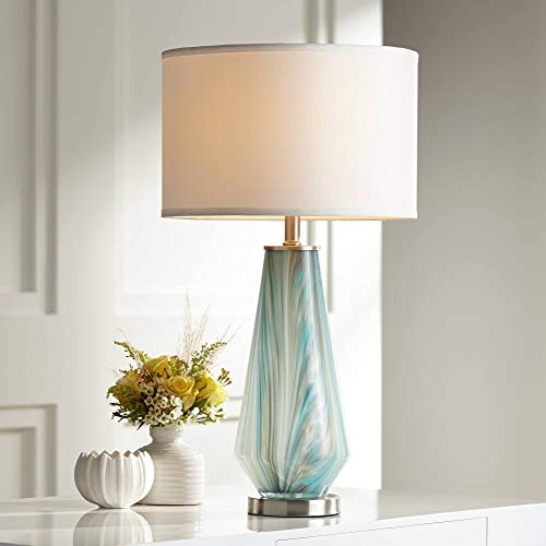
Statement Fixture Selections
Chandeliers with metallic finishes serve as stunning focal points in gray and blue living rooms, particularly those featuring gold, brass, or brushed nickel details. Large scale pendant lights positioned above seating areas anchor the space while drawing attention to your carefully curated furniture arrangement. We’ve found that geometric shapes and sculptural designs add visual sophistication without overwhelming the serene color palette.
Floor lamps with unique architectural elements complement gray and blue schemes while providing essential task lighting for reading or conversation areas. Metallic bases in warm finishes create beautiful contrast against cool wall colors, while fabric shades in complementary tones maintain color harmony. Consider selecting fixtures with adjustable heights or directional capabilities to maximize functionality.
Wall sconces positioned strategically around your gray and blue living room create ambient lighting layers that enhance the room’s sophisticated atmosphere. Fixtures with metallic accents or unique geometric patterns add visual interest while maintaining the space’s elegant aesthetic. We recommend installing dimmer switches on statement fixtures to control lighting intensity throughout different times of day.

Conclusion
We’ve explored how gray and blue create the perfect foundation for sophisticated living room design. From classic navy and charcoal combinations to serene powder blue schemes this versatile palette offers endless possibilities for every style preference.
The key to success lies in balancing these cool tones with warm lighting thoughtful textures and strategic metallic accents. Whether you’re drawn to vintage charm or contemporary minimalism the 60-30-10 color rule ensures harmonious distribution throughout your space.
Remember that seasonal updates and mixed patterns keep your gray and blue living room feeling fresh and personalized. With proper lighting answers and carefully chosen furniture pieces you’ll create a space that’s both timeless and uniquely yours.
Frequently Asked Questions
What is the 60-30-10 rule for gray and blue living rooms?
The 60-30-10 rule is a color distribution guideline where you use 60% of your dominant color (like charcoal gray), 30% of your secondary color (such as navy blue), and 10% of accent colors (like crisp white or cream). This creates a balanced, visually appealing space without overwhelming any single color.
How do I prevent gray and blue rooms from feeling too cold?
Select gray and blue shades with warm undertones rather than stark, cool versions. Incorporate warm lighting (2700K-3000K temperature), add natural textures like wood and wool, and include metallic accents in brass or gold. These elements add warmth and prevent the space from feeling sterile.
What furniture works best in a gray and blue living room?
A charcoal gray sectional serves as an excellent visual anchor, paired with navy accent chairs. Choose pieces with warm undertones and mix textures like velvet sofas, wooden coffee tables, and woven fabrics. Two-tone furniture in alternating gray and blue can create visual interest and cohesion.
Can I use patterns in a gray and blue color scheme?
Yes, geometric patterns and prints work beautifully in gray and blue rooms. Consider Moroccan-inspired rugs, abstract patterns, or striped textiles. Stick to your established color palette when selecting patterned pieces to maintain harmony while adding visual interest and depth.
What lighting works best for gray and blue living rooms?
Use warm ambient lighting (2700K-3000K) to counterbalance cool tones, layered with cooler task lighting for functionality. Combine chandeliers, floor lamps, and wall sconces to create depth. Statement fixtures in metallic finishes can enhance the sophisticated aesthetic while providing proper illumination.
How can I add vintage charm to a gray and blue living room?
Incorporate antique furniture pieces like vintage armchairs with original faded blue or weathered gray upholstery. Mix different eras of furniture for visual depth, use classic powder blue as your foundation, and add distressed wooden tables as focal points to create nostalgic storytelling appeal.
What metallic accents work with gray and blue decor?
Silver and chrome provide sleek, contemporary contrast, while brass and gold add warmth and luxury. Consider chrome coffee tables, silver decorative accessories, gold throw pillows, or brass light fixtures. These metallics enhance the sophisticated palette and add visual depth to the space.
How do I create a coastal vibe with gray and blue?
Use light gray as your dominant color paired with powder blue accents, maximize natural light, and incorporate natural elements like driftwood, seagrass, and linen textures. Add white or cream accents and choose furniture with weathered or distressed finishes to enhance the coastal aesthetic.