We’ve all experienced that moment when we walk into a room and feel instantly captivated by its atmosphere. The secret behind this magic often lies in the perfect color palette that transforms an ordinary space into something extraordinary.
Your living room deserves more than just any paint color – it deserves a thoughtfully curated scheme that reflects your personality while creating the ideal ambiance for relaxation and entertainment. Whether you’re drawn to bold statement walls or prefer subtle neutral tones, the right color combination can make your space feel larger, cozier, or more sophisticated.
We’ll guide you through proven color strategies that interior designers use to create stunning living rooms that both impress guests and provide daily comfort. From timeless classics to trending palettes, you’ll discover how to choose colors that work harmoniously with your furniture, lighting, and lifestyle needs.
Warm and Cozy Living Room Color Ideas
Creating an inviting atmosphere starts with selecting colors that naturally embrace you when you walk through the door. We’ve curated these warm living room color palettes that interior designers consistently rely on to transform ordinary spaces into cozy retreats.
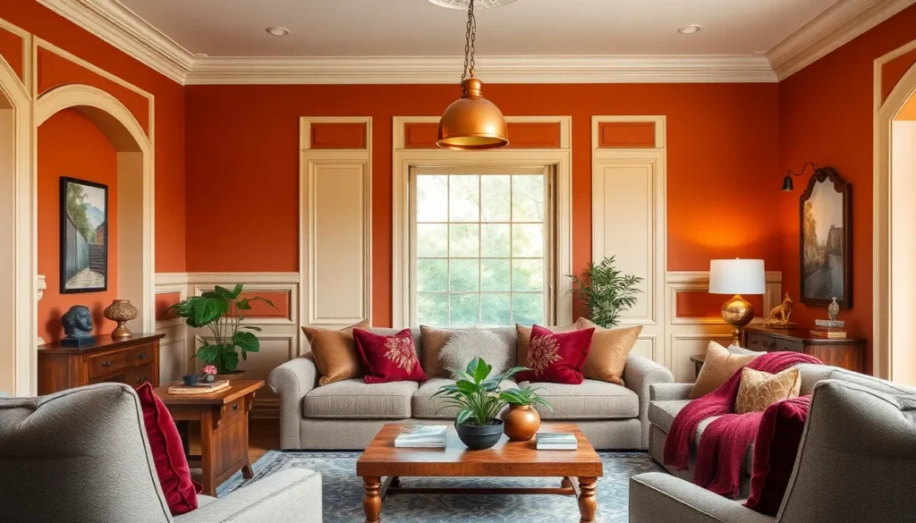
Rich Terracotta and Burnt Orange Schemes
Terracotta walls create an instantly welcoming foundation that makes any living room feel like a sophisticated sanctuary. We recommend pairing these earthy orange tones with cream or ivory trim to prevent the space from feeling overwhelming. Burnt orange accent pieces such as throw pillows, artwork, or decorative vases add depth without requiring a complete room makeover.
Natural textures complement terracotta beautifully, so consider incorporating woven baskets, jute rugs, or wooden furniture pieces. Clay colored paint works exceptionally well on a single accent wall, allowing you to experiment with warmth while maintaining balance. Copper light fixtures enhance the earthy undertones and create stunning visual connections throughout the space.
Deep Burgundy and Wine Tones
Burgundy creates dramatic sophistication that transforms your living room into an elegant retreat perfect for evening entertaining. We suggest using wine colored accents against neutral walls to achieve luxury without overwhelming smaller spaces. Deep red throw blankets, curtains, or upholstered chairs introduce this rich color while maintaining flexibility for seasonal changes.
Wine tones pair beautifully with gold hardware, brass picture frames, and warm wood finishes like cherry or mahogany. Burgundy works particularly well in rooms with high ceilings or abundant natural light, where the deep color won’t make the space feel cramped. Consider burgundy bookshelves or a statement sofa to anchor the room with confident color choices.
Golden Yellow and Amber Accents
Golden yellow instantly brightens any living room while maintaining the cozy warmth that makes spaces feel genuinely inviting. We recommend using amber tones through lighting fixtures, decorative objects, or textured wall treatments that catch and reflect natural light throughout the day. Mustard colored accent pillows or throws add warmth without the commitment of painted walls.
Honey colored wood furniture naturally complements golden yellow schemes, creating cohesive warmth that feels both modern and timeless. Amber glass vases, yellow artwork, or golden picture frames introduce this sunny color in manageable doses. Yellow works exceptionally well in north facing rooms that need extra brightness, instantly making them feel more welcoming and spacious.


Cool and Calming Living Room Color Ideas

We’ve explored warm and inviting palettes, but cool tones can create equally stunning living spaces that promote relaxation and tranquility. These sophisticated color schemes work beautifully to establish a serene atmosphere perfect for unwinding after busy days.
Soft Blue and Seafoam Green Palettes
Soft blue and seafoam green palettes create naturally calming environments that evoke the peaceful essence of water and coastal landscapes. These hues are scientifically recognized for their ability to reduce stress and promote relaxation, making them ideal choices for living rooms where we gather to unwind.
Light blue walls serve as a perfect foundation, while seafoam green accents through throw pillows, artwork, or area rugs add depth and visual interest. The combination works exceptionally well in both modern minimalist spaces and traditional coastal inspired interiors.
Consider pairing these water inspired tones with crisp white trim to enhance their fresh, airy quality. Natural light amplifies their calming effects, so we recommend maximizing window treatments that allow sunlight to filter through beautifully.
Lavender and Sage Color Combinations
Lavender and sage combinations offer a sophisticated approach to cool living room design that balances gentle warmth with refreshing coolness. Current interior design trends heavily favor these restorative colors for their ability to create harmonious, inviting atmospheres.
Lavender introduces subtle sophistication through soft furnishings like curtains, accent chairs, or decorative accessories. Sage green grounds the palette with its earthy, organic qualities that connect us to nature’s calming influence.
Natural materials complement this color duo perfectly, so we suggest incorporating wooden coffee tables, woven baskets, or stone decorative elements. The combination creates a balanced environment that feels both contemporary and timeless.
Cool Gray and Silver Schemes
Cool gray and silver schemes deliver modern elegance with understated sophistication that makes living rooms feel spacious and serene. These neutral tones provide versatile backdrops that allow furniture and architectural features to become focal points.
Cool gray walls create the perfect canvas for showcasing colorful artwork, vibrant plants, or statement furniture pieces. Silver accents through metallic picture frames, lamp bases, or decorative bowls add reflective qualities that enhance natural light distribution.
Ample natural light transforms these metallic tones into ever-changing design elements that shift subtly throughout the day. Contemporary finishes like brushed steel hardware or chrome light fixtures complete the polished, sophisticated aesthetic that defines modern living spaces.


Neutral Living Room Color Ideas That Never Go Out of Style

We’ve found neutral living room colors offer unmatched versatility and timeless appeal that adapts to any décor style. These versatile palettes create calming environments while serving as adaptable backgrounds for various design approaches.
Classic Beige and Cream Combinations
Beige foundations create warm and elegant living spaces that instantly feel inviting to guests and family members. We recommend using classic beige as your primary wall color since it serves as a perfect foundation for layering additional elements. Cream accents add light and dimension through throw pillows, curtains, and decorative accessories.
Natural wood finishes complement beige beautifully, creating a cohesive look that feels both grounded and sophisticated. Soft textiles like linen sofas, wool rugs, and cotton throws enhance the warmth these colors naturally provide. Both traditional and contemporary interiors benefit from this classic combination since it never feels outdated or overly trendy.
Modern Gray and White Palettes
Gray and white define modern aesthetics with their clean lines and sophisticated appeal. Light gray walls paired with crisp white trim create an airy space that feels larger and brighter than darker alternatives. We’ve observed how cool grays evoke sophistication while maintaining a welcoming atmosphere.
Balance becomes crucial when working with this palette to avoid creating a space that feels cold or sterile. White elements bring brightness and openness that counteract any potential coolness from gray tones. Minimalist and urban inspired designs particularly benefit from this combination since it supports both bold artwork and understated furnishings.
Warm Taupe and Mushroom Tones
Taupe provides a gentle transition between gray and beige, offering the best qualities of both color families. We appreciate how these colors introduce subtle warmth without overwhelming smaller living spaces. Mushroom tones blend gray and brown elements to create a soothing, earthy sophistication that feels naturally grounding.
Flexible warmth makes taupe an ideal choice for homeowners seeking balance in their color schemes. Spaces requiring both relaxation and refinement benefit most from these sophisticated neutrals. Both colors work exceptionally well in rooms where you want to create a calm atmosphere while maintaining visual interest through texture and layered décor elements.


Bold and Dramatic Living Room Color Ideas

While neutral and calming tones create serene spaces, bold color choices make powerful statements that transform living rooms into sophisticated showcases. These dramatic palettes demand confidence but reward homeowners with spaces that feel luxurious and visually striking.
Deep Navy and Emerald Statement Walls
Deep navy walls create a sophisticated ambiance that instantly elevates any living room’s elegance. This rich color serves as the perfect foundation for creating dramatic focal points while maintaining a sense of refined luxury. Navy’s versatility allows it to work beautifully in both traditional and contemporary settings.
Emerald green accents bring vibrant energy when paired with deep navy backgrounds. We recommend using emerald as a statement wall color to add glamour and create striking visual contrast against navy elements. This combination works particularly well when you incorporate metallic finishes like brass or gold hardware.
Professional designers often use this navy and emerald pairing for clients seeking bold sophistication without overwhelming brightness. The deep tones create intimate gathering spaces that feel both cozy and grand.
Rich Plum and Jewel Tone Accents
Rich plum walls add warmth and elegance that makes living rooms feel like luxurious sanctuaries. This deep purple hue creates an inviting atmosphere while maintaining the drama that bold color enthusiasts crave. Plum works exceptionally well in rooms with ample natural light or strategic artificial lighting.
Jewel toned accents like sapphire blue and amethyst purple enhance plum’s natural richness. These vibrant colors create depth and visual interest when used in throw pillows, artwork, or decorative accessories. We suggest incorporating emerald green elements alongside sapphire accents to create a truly lavish jewel tone palette.
This combination appeals to homeowners who want their living spaces to feel like opulent retreats. The resulting atmosphere promotes both relaxation and impressive entertaining.
Black and White High-Contrast Schemes
Black and white combinations create high contrast looks that appear modern and sleek in contemporary living rooms. This classic pairing offers unmatched versatility while making bold visual statements that never go out of style. The stark contrast allows architectural features and furniture pieces to stand out dramatically.
Metallic accents in gold or silver finishes add luxury touches that elevate basic black and white schemes. We recommend incorporating these metallic elements through light fixtures, picture frames, or decorative hardware to prevent the palette from feeling too stark. Brass warming elements work particularly well with white dominant schemes.
This timeless approach suits homeowners who prefer clean lines with maximum visual impact. The versatile foundation accommodates changing decor trends while maintaining sophisticated appeal.


Earth-Inspired Living Room Color Ideas

Drawing inspiration from nature’s most beautiful landscapes brings tranquility and grounding energy into your living space. These earth-toned palettes create harmonious environments that connect us to the natural industry while maintaining sophisticated style.
Forest Green and Natural Wood Tones
Forest green walls create an instantly calming atmosphere reminiscent of deep woodland retreats. This rich, saturated color works beautifully as an accent wall behind your sofa or as a full room treatment for dramatic impact.
Natural wood tones in oak, walnut, or pine furniture complement forest green perfectly by adding warmth and organic texture. Coffee tables, entertainment centers, and wooden picture frames in these finishes create visual depth while maintaining the nature-inspired theme.
Accent colors like earthy browns, warm beiges, and mossy greens enhance this palette without overwhelming the space. Throw pillows in these complementary shades, area rugs with natural patterns, and pottery in earth tones complete the forest-inspired look.
Desert Sand and Cactus Color Palettes
Desert sand serves as a versatile neutral base that evokes the serene beauty of southwestern landscapes. These soft, warm beige tones on walls create an inviting backdrop that works with both modern and traditional furnishings.
Cactus-inspired accent colors including terracotta, ochre, and sienna add vibrant energy to desert sand foundations. Decorative pottery, throw blankets, and artwork in these warm earth tones bring the desert’s natural beauty indoors.
Turquoise and malachite accents provide stunning contrast against the warm desert palette. These jewel-toned elements work beautifully in decorative accessories, accent pillows, or statement artwork to create authentic southwestern charm.
Stone Gray and River Rock Combinations
Stone gray walls offer a sophisticated neutral foundation that mimics natural rock formations. This cool-toned base provides excellent versatility for both contemporary and rustic design styles while maintaining an organic connection to nature.
River rock color combinations incorporate soft blues, gentle greens, and varied grays that reflect the smooth stones found in natural waterways. Area rugs with these mixed tones, decorative bowls, and textured throw pillows capture this serene palette beautifully.
Earthy red and warm orange accents introduce necessary warmth to prevent the stone gray palette from feeling too cool. Terra cotta planters, rust-colored throw blankets, and copper lighting fixtures add depth and visual interest to complete the river rock aesthetic.


Monochromatic Living Room Color Ideas for Modern Homes

Monochromatic color schemes create sophisticated living spaces that feel cohesive and intentionally designed. These single-color approaches allow you to explore depth and texture while maintaining visual harmony throughout your modern home.
All-White Minimalist Schemes
All-white color schemes create bright, clean looks that emphasize minimalism and simplicity in modern homes. This approach transforms your living room into a serene sanctuary where every element contributes to an uncluttered aesthetic. White walls paired with ivory furniture and cream accessories establish layers of subtle variation without disrupting the monochromatic flow.
Texture becomes your primary design tool when working with all-white palettes. Incorporate linen throw pillows, wool rugs, and ceramic vases to add visual interest without introducing color. Natural light amplifies the brightness of white schemes, making smaller living rooms appear more spacious and airy.
Architectural details shine in all-white environments where nothing competes for attention. Crown molding, exposed beams, and built-in shelving become focal points that define your space’s character. We recommend adding plants in white planters to introduce life while maintaining your monochromatic vision.
Varying Shades of Blue Palettes
Varying shades of blue palettes offer a versatile range from soft sky tones to deep navies for monochromatic designs. This color family evokes calmness and serenity while providing enough variety to create ever-changing visual interest. Light powder blue walls can be complemented by navy accent furniture and medium blue textiles.
Ocean-inspired blue schemes work particularly well in modern living rooms with coastal influences. Consider pairing pale cerulean walls with deeper teal accessories and midnight blue artwork. These combinations create depth while maintaining the soothing qualities that make blue palettes so appealing.
Different blue tones can define separate areas within open-concept living spaces. Use lighter blues in conversation areas to promote relaxation, while deeper blues in reading nooks create intimate, focused environments. Metallic accents in silver or brushed nickel enhance blue monochromatic schemes without breaking the color harmony.
Gray-on-Gray Sophisticated Looks
Gray-on-gray sophisticated looks create modern aesthetics using different shades for versatile decorating options. This approach allows minimal color contrasts while building rich, layered environments that feel both contemporary and timeless. Charcoal walls paired with light gray furniture and silver accessories establish elegant sophistication.
Warm grays versus cool grays can dramatically change your living room’s atmosphere. Warm gray tones with beige undertones create cozy, inviting spaces, while cool grays with blue undertones feel more crisp and modern. We suggest testing multiple gray samples in your exact lighting conditions before committing to your palette.
Texture variation becomes essential in gray monochromatic schemes to prevent flat appearances. Incorporate velvet sofas, nubby throw blankets, and smooth marble coffee tables to create tactile interest. Natural wood elements in weathered finishes add warmth without disrupting your gray color story, while black accents provide definition and prevent the space from feeling washed out.


Seasonal Living Room Color Ideas to Refresh Your Space

We’ll explore how changing your living room colors with the seasons creates fresh, ever-changing spaces that reflect nature’s rhythm throughout the year.
Spring Pastels and Fresh Greens
Pastel shades bring instant renewal to our living spaces after winter’s end. Soft pink walls create a gentle backdrop while baby blue accents on throw pillows and artwork add serene touches. Mint green elements through curtains or accent chairs complete this calming atmosphere that mirrors spring’s gentle awakening.
Fresh greens enhance the natural feel we crave during spring months. Light greenery like ferns positioned near windows brings life indoors while succulents on coffee tables add modern botanical touches. These living elements complement pastel walls beautifully while purifying our indoor air.
Accent colors in white or cream maintain the brightness essential for spring decorating. Natural wood picture frames and side tables add warmth without overwhelming the delicate color palette. White trim around windows and doorways amplifies natural light while cream textiles soften hard surfaces throughout the room.
Summer Brights and Coastal Blues
Coastal blues evoke the refreshing feel of ocean breezes in our summer living spaces. Sky blue walls create an airy foundation while navy blue furniture pieces add sophisticated depth. These blue tones naturally cool our spaces during warmer months while maintaining year round elegance.
Bright whites amplify summer’s abundant natural light throughout our rooms. Crisp white walls reflect sunlight beautifully while white furniture pieces create the coastal feel we desire. This brightness helps our spaces feel larger and more open during the season when we entertain most frequently.
Accent colors like coral and yellow create the lively ambiance perfect for summer gatherings. Coral throw pillows on white sofas add warmth while yellow lampshades bring sunshine indoors. These vibrant pops energize our coastal blue foundation without overwhelming the serene summer atmosphere.
Autumn Warm Tones and Harvest Colors
Warm tones bring the coziness we crave as temperatures drop and days shorten. Terracotta accent walls create intimate conversation areas while sienna colored throws add textural warmth to neutral sofas. Golden brown leather chairs anchor our autumn spaces with rich, inviting comfort.
Harvest colors reflect the season’s natural abundance in our interior design choices. Deep reds in area rugs ground our living spaces while orange accent pillows celebrate autumn’s vibrant energy. Yellow artwork or pottery pieces capture the warmth of harvest sunlight streaming through our windows.
Accent colors in rich wood tones enhance the autumnal atmosphere we’re creating. Deep greens like olive in plant choices or throw blankets complement the warm harvest palette beautifully. These natural accent colors help bridge our indoor spaces with the changing industry outside.
Small Living Room Color Ideas to Maximize Space

When working with compact living rooms, color becomes our most powerful tool for creating the illusion of spaciousness. Strategic color choices can transform even the smallest spaces into airy, open environments that feel significantly larger than their actual square footage.
Light Colors That Open Up the Room
Soft neutrals create an immediate sense of expansion in compact living spaces. Colors like Spare White by Sherwin-Williams or light shades from Benjamin Moore make small rooms feel larger by creating visual continuity throughout the space. These pale tones reflect natural light effectively and eliminate visual barriers that darker colors often create.
Monochromatic schemes maximize spatial perception when we paint walls, trim, and baseboards the same light color. This technique removes visual breaks that typically segment a room into smaller sections. White, cream, and pale gray work particularly well for this approach since they maintain brightness while creating seamless flow.
Light blue and soft green tones offer alternative options that still promote openness while adding subtle character. These colors maintain the space expanding qualities of neutrals while introducing gentle personality to our small living rooms.
Strategic Color Placement Techniques
Accent walls create focal points without overwhelming compact spaces when we use darker or bolder colors on just one wall. This technique draws the eye to a exact area while maintaining the room’s overall sense of openness. Navy blue or deep forest green work effectively as accent colors against lighter surrounding walls.
Ceiling and trim contrast adds vertical dimension to small living rooms when we paint the ceiling a lighter shade than the walls. This color strategy helps create a sense of height and prevents the ceiling from feeling oppressively low. Bright white ceilings paired with soft gray walls exemplify this effective technique.
Horizontal color blocking can make narrow rooms appear wider when we paint the lower third of walls in a slightly darker shade. This visual trick changes the room’s perceived proportions without sacrificing the benefits of light colors.
Mirror and Metallic Accent Strategies
Strategically placed mirrors reflect natural light and create the illusion of expanded space in small living rooms. Large mirrors positioned opposite windows double the amount of visible light while creating depth through reflection. Multiple smaller mirrors arranged as a gallery wall can achieve similar effects while adding decorative interest.
Metallic finishes add depth and light reflection through furniture and accessories featuring gold or silver tones. These reflective surfaces bounce light around the room while creating visual interest without adding color weight. Chrome picture frames, brass table lamps, and silver decorative objects work particularly well for this purpose.
High gloss finishes amplify light reflection when we use them with darker accent colors like Tricorn Black by Sherwin-Williams. These glossy surfaces create sophisticated drama while maintaining the light reflecting properties that help small spaces feel larger.


Conclusion
We’ve explored how the right color palette can completely transform your living room from ordinary to extraordinary. Whether you’re drawn to warm earth tones that create cozy gathering spaces or prefer cool blues that promote relaxation the key lies in choosing colors that reflect your personal style while serving your lifestyle needs.
Remember that color isn’t just about aesthetics—it’s about creating an atmosphere where you’ll love spending time. From bold dramatic schemes that make sophisticated statements to subtle neutrals that provide timeless elegance each approach offers unique benefits for your space.
The beauty of these color strategies is their adaptability. You can easily refresh your living room seasonally switch between monochromatic schemes for modern appeal or mix earth-inspired palettes for natural tranquility. Start with one color idea that resonates with you and watch how it transforms not just your space but your entire home experience.
Frequently Asked Questions
What colors make a living room feel larger?
Light colors like soft neutrals, pale tones, and whites create the illusion of spaciousness by reflecting more light. Monochromatic schemes maintain visual continuity, while strategic use of mirrors and metallic accents can further enhance the feeling of openness in small living rooms.
Which color palettes work best for creating a cozy atmosphere?
Warm color palettes featuring rich terracotta, burnt orange, deep burgundy, and golden yellow create inviting, cozy atmospheres. These earthy tones can be balanced with cream or ivory trim and enhanced with natural textures and warm lighting fixtures.
How do cool colors affect the mood of a living room?
Cool colors like soft blues, seafoam greens, lavender, and sage create serene, calming environments that promote relaxation. These tones evoke tranquility and are perfect for spaces where you want to unwind and feel peaceful.
Are neutral colors boring for living room design?
Not at all! Neutral colors offer unmatched versatility and timeless appeal. Classic beige and cream, modern gray and white, or warm taupe and mushroom tones provide sophisticated backdrops that allow furniture and accessories to shine while maintaining elegance.
What are some bold color combinations for dramatic living rooms?
Deep navy with emerald green accents, rich plum walls with jewel-toned accessories, and high-contrast black and white schemes create sophisticated, dramatic looks. These bold combinations work well in both traditional and contemporary settings when balanced properly.
How can I incorporate earth-inspired colors in my living room?
Use forest green walls with natural wood tones, desert sand as a neutral base with terracotta and ochre accents, or stone gray walls with river rock combinations including soft blues and greens. These palettes create tranquil, grounding environments.
What are monochromatic color schemes and do they work?
Monochromatic schemes use varying shades of a single color to create cohesive, sophisticated spaces. All-white minimalist looks, varying blues for coastal vibes, or gray-on-gray combinations allow for rich layering while maintaining harmony and intentional design.
Should I change my living room colors seasonally?
Seasonal color updates can refresh your space throughout the year. Spring pastels and greens evoke renewal, summer coastal blues and whites maintain coolness, while autumn’s warm terracotta and sienna tones create cozy environments that celebrate seasonal changes.
How do I choose colors that complement my furniture?
Consider your existing furniture’s undertones and style. Neutral backgrounds allow statement pieces to shine, while complementary colors can enhance specific furniture finishes. Test color samples in different lighting conditions to ensure harmony with your existing pieces.
What’s the biggest mistake people make with living room colors?
The biggest mistake is choosing colors without considering lighting, room size, and existing elements. Always test paint samples in your actual space, observe them at different times of day, and ensure the palette harmonizes with your furniture and lifestyle needs.