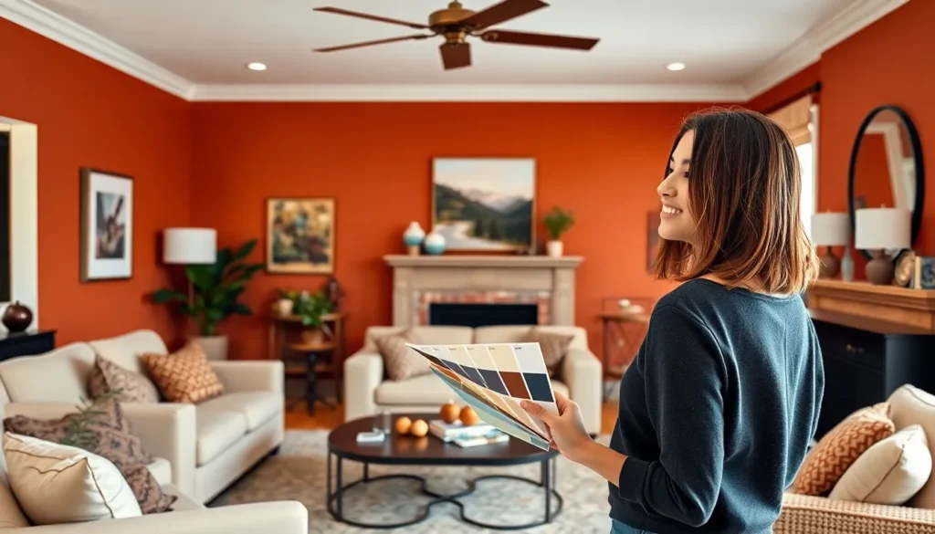
Choosing the perfect paint color for your living room can transform your entire home’s atmosphere and make or break your interior design vision. We’ve all stood in the paint aisle feeling overwhelmed by endless color swatches wondering which shade will create the cozy retreat we’re dreaming of.
The right living room paint color doesn’t just beautify your space—it sets the mood for every gathering and creates a backdrop that reflects your personal style. Whether you’re drawn to warm neutrals that invite conversation or bold statement walls that spark creativity we’ll guide you through the most stunning color combinations that work.
We’ve curated the ultimate collection of living room paint ideas that’ll help you discover your perfect palette. From timeless classics to trending hues that’ll make your space Instagram-worthy you’ll find inspiration that matches your lifestyle and budget.
Warm and Cozy Living Room Paint Color Ideas
Creating a welcoming atmosphere starts with selecting paint colors that embrace comfort and intimacy. We’ve identified the most effective warm tones that transform any living space into a cozy retreat.
Rich Terracotta and Burnt Orange Tones
Terracotta brings earthy sophistication to living rooms with its natural clay undertones. We recommend Benjamin Moore’s Sedona Clay (2174-30) for accent walls that create visual warmth without overwhelming the space. Sherwin Williams’ Cavern Clay (SW 7701) offers a lighter terracotta option that pairs beautifully with cream trim and natural wood furniture.
Burnt orange creates dramatic focal points when applied strategically to feature walls or built-in shelving. Colors like Behr’s Canyon Dusk (S210-4) work exceptionally well in rooms with abundant natural light. We suggest balancing these bold tones with neutral furniture in whites, creams, or soft grays to prevent color overload.
Russet shades provide deeper warmth for living rooms that need more dramatic transformation. Farrow & Ball’s Red Earth (No. 64) delivers rich pigmentation that changes beautifully throughout the day as lighting shifts from morning to evening.
Soft Cream and Beige Neutrals
Cream colors establish timeless elegance while maintaining cozy undertones that pure white cannot achieve. We favor Benjamin Moore’s White Dove (OC-17) for its subtle warmth and versatility with both modern and traditional furnishings. This shade reflects light beautifully while avoiding the stark coldness of bright whites.
Beige tones offer foolproof warmth that complements virtually any decorating style or existing furniture pieces. Sherwin Williams’ Accessible Beige (SW 7036) provides the perfect balance between gray and brown undertones. We’ve seen this color work exceptionally well in open concept spaces where living rooms flow into dining areas or kitchens.
Mushroom and taupe shades create sophisticated depth without sacrificing the cozy factor essential for comfortable living spaces. Colors like Benjamin Moore’s Revere Pewter (HC-172) bring warmth through their slight brown undertones while maintaining enough gray to feel contemporary and fresh.
Deep Burgundy and Wine Shades
Burgundy creates luxurious intimacy perfect for evening entertaining and relaxation. We recommend using deep wine colors like Benjamin Moore’s Pomegranate (AF-295) on single accent walls to avoid overwhelming smaller spaces. These rich tones pair beautifully with gold accents, brass fixtures, and warm wood furniture.
Wine colored walls establish dramatic backdrops for artwork and family photos while maintaining sophisticated appeal. Sherwin Williams’ Rookwood Dark Red (SW 2801) offers depth that changes throughout the day, appearing almost black in low light and revealing its burgundy richness in brighter conditions.
Claret and maroon shades bring unexpected elegance to traditional and eclectic living room designs. We suggest testing these colors in different lighting conditions before committing, as they can appear dramatically different under artificial versus natural light sources.
Cool and Calming Living Room Paint Color Ideas

After exploring those warm and inviting tones, let’s shift our focus to colors that bring tranquility and serenity to your living space.
Serene Blues and Navy Accents
Blues create the ultimate foundation for tranquil living rooms that feel fresh and peaceful. Shades like inky blue, slate blue, and steely green deliver a soothing ambiance that instantly calms the mind. Navy accents add sophisticated depth without overwhelming your space, providing that perfect balance between bold and serene.
We love how nature-inspired blues promote a connection to the outdoors while maintaining that relaxed atmosphere you’re seeking. These versatile shades work beautifully as statement walls or throughout the entire room, depending on your design goals. Blues also pair exceptionally well with white trim and natural wood elements for a coastal or contemporary look.
Sage Green and Eucalyptus Hues
Sage green ranks as our top choice for creating calming, cozy living spaces that feel effortlessly sophisticated. This muted, earthy tone pairs beautifully with warm furnishings and soft textures, making any room feel inviting and peaceful. Eucalyptus inspired greens, particularly those soft green grays, instill a sense of relaxation and natural beauty that works perfectly in rooms of any size.
These timeless colors balance nature’s freshness with sophisticated interior design, creating spaces that never feel outdated. We recommend sage green for homeowners who want a neutral that’s more interesting than beige but just as versatile. The color works especially well with brass fixtures, cream colored furniture, and natural fiber rugs.
Soft Gray and Charcoal Combinations
Gray palettes offer the most versatile foundation for modern living rooms, especially when you combine soft gray with charcoal accents. These sophisticated tones provide neutrality that adapts to both warm and cool lighting conditions, depending on your accent colors and decor choices. Grays complement bold accent colors beautifully while maintaining that serene environment you’re after.
Contemporary and minimalist aesthetics particularly benefit from these refined combinations. We suggest using soft gray as your main wall color and incorporating charcoal through furniture, artwork, or accent walls. This approach creates visual interest without sacrificing the calm atmosphere that makes living rooms truly relaxing.
For 2025 trends, consider colors like Sherwin Williams’ Quietude, a peaceful blue gray, or Behr’s Frosted Jade, a calming green gray that perfectly captures this cool and calming aesthetic.
Bold and Dramatic Living Room Paint Color Ideas

Moving from calming hues to bolder choices creates an entirely different atmosphere. We’ll explore striking paint colors that transform living spaces into dramatic statement rooms.
Statement Black and Charcoal Walls
Black paint transforms living rooms into sophisticated havens of luxury and drama. Using black walls works exceptionally well in rooms with abundant natural light, where the contrast creates stunning visual impact. We recommend this approach for homeowners seeking opulent, gallery-like atmospheres that make artwork and furniture pop dramatically.
Charcoal gray offers a slightly softer alternative while maintaining sophisticated drama. This versatile shade provides the same striking effect as black but feels more approachable for everyday living. Charcoal walls create depth and richness that works beautifully with metallic accents like gold or brass fixtures.
Jewel Tones Like Emerald and Sapphire
Emerald green delivers luxurious vibrancy that instantly elevates any living space. This rich jewel tone works magnificently as an accent wall, creating a stunning focal point that draws attention without overwhelming the room. We suggest pairing emerald with neutral tones like cream or warm white to balance its intensity.
Sapphire blue evokes elegance and sophistication through its deep, regal presence. This dramatic color creates striking visual interest, especially when combined with lighter blue shades or neutral palettes. Sapphire walls provide the perfect backdrop for brass hardware, white trim, and natural wood elements.
Rich Purple and Plum Accents
Rich purple tones add warmth and luxury that creates intimate, cozy atmospheres. Deep purple works exceptionally well as accent walls, providing bold visual impact while maintaining livability. We recommend combining purple with neutral colors to create sophisticated color schemes that feel both dramatic and welcoming.
Plum accents offer versatile drama through strategic color placement throughout your space. This sophisticated hue can be applied through accent walls, built-in bookcases, or architectural details to create visual interest. Plum works beautifully with cream, gold, and soft gray tones for a balanced yet bold aesthetic.
Neutral Living Room Paint Color Ideas That Never Go Out of Style

After exploring bold and dramatic colors, we understand that many homeowners prefer the enduring appeal of neutral tones. These versatile shades create a perfect foundation for any decorating style while maintaining their popularity year after year.
Classic White and Off-White Variations
School House White delivers a light, crisp appearance that provides a modern feel perfect for brightening up any room. This fresh white shade works exceptionally well in living rooms with limited natural light, instantly making spaces feel larger and more open.
Shadow White offers an ideal solution for those who prefer a slightly darker shade of white while maintaining a warm and inviting atmosphere. We recommend this subtle variation for living rooms where pure white might feel too stark or cold against existing furnishings.
Timeless Greige and Mushroom Tones
Greige colors blend gray and beige elements to provide a soothing and neutral background for any decor style. This sophisticated combination works beautifully with both contemporary furniture and traditional pieces, making it our top choice for versatile living room designs.
Mushroom tones add warmth and coziness to living rooms while complementing both modern and traditional decor seamlessly. These earthy shades create depth without overwhelming the space, offering a rich alternative to standard beige options.
Warm Taupe and Linen Shades
Taupe paint represents a versatile, earthy color that works well with a variety of decorating styles and never goes out of style. We’ve found that taupe serves as an excellent backdrop for colorful artwork and accessories while maintaining its sophisticated appeal across different lighting conditions.
Linen shades provide soft and natural tones that add a light, airy feel to rooms while making spaces appear more spacious. These gentle neutrals pair beautifully with white trim and natural wood elements, creating a harmonious living environment that feels both fresh and timeless.
Two-Tone Living Room Paint Color Ideas for Visual Interest

Two-tone paint combinations create stunning visual depth while allowing you to showcase your personality through bold color pairings. These strategic color choices transform ordinary living rooms into sophisticated spaces that feel both ever-changing and harmonious.
Accent Wall Combinations
Warm and cool contrasts work beautifully when you pair earth tones like terracotta or caramel with cooler shades such as light blue or pale green. This combination creates visual balance while maintaining a welcoming atmosphere throughout your space.
Neutral and bold pairings offer another striking approach where you can combine a neutral base with vibrant accent colors like navy blue or emerald green. Benjamin Moore’s Cinnamon Slate serves as an excellent neutral foundation that pairs perfectly with these dramatic accent shades.
Monochromatic gradients create sophisticated depth by using different shades of the same color family on adjacent walls. Consider painting one wall in sage green while choosing a lighter eucalyptus shade for the connecting wall to maintain color harmony.
Complementary color schemes provide maximum visual impact when you paint one wall in vibrant red or orange and pair it with its complementary color like green or blue on adjacent surfaces. This technique works especially well in larger living rooms where bold statements enhance the overall design.
Wainscoting and Trim Contrasts
White and wood combinations deliver timeless elegance when you pair crisp white trim with natural wood wainscoting elements. This classic approach works particularly well with warm neutrals like camel and beige from BEHR’s 2025 palette on the upper wall portions.
Rich stain contrasts add sophisticated depth when you use richly stained wood trim alongside lighter wall colors. Consider pairing dark walnut or mahogany trim with soft cream or warm taupe walls to create striking architectural interest.
Two-tone wainscoting allows you to paint the lower portion in a deeper shade while keeping upper walls lighter for visual balance. Try painting wainscoting in deep navy while maintaining upper walls in classic white or soft gray for a refined coastal look.
Ceiling and Wall Color Pairings
Soft contrast approaches work when you paint the ceiling a lighter version of your wall color to create cohesive visual flow. This technique makes rooms feel larger while maintaining color continuity throughout the space.
Dramatic contrast combinations use much darker ceiling colors than wall colors to create intimate, cozy atmospheres. Consider painting ceilings in charcoal or deep plum while keeping walls in lighter neutrals for a sophisticated cocoon effect.
Optimistic accent ceilings incorporate trending colors like Optimistic Yellow on ceiling surfaces while maintaining neutral wall tones. This approach adds unexpected cheerfulness without overwhelming your living room’s overall color scheme.
Small Living Room Paint Color Ideas to Maximize Space

Working with a compact living room doesn’t mean sacrificing style for space. We’ll show you how strategic paint choices can transform your small room into an airy, spacious haven.
Light Colors That Reflect Natural Light
Brilliant White stands out as our top recommendation for maximizing space through light reflection. This crisp shade enhances brightness and creates an immediate sense of openness in cramped quarters.
Off-white and greige tones offer sophisticated alternatives that maintain airiness without the starkness of pure white. These neutral shades work particularly well in rooms with limited natural light sources.
Pastel colors create an airy effect when applied above eye level on walls. Consider soft blues, gentle pinks, or pale yellows to add subtle color while maintaining the illusion of height.
Horseradish, a warm off-white, makes the most of limited natural light according to color experts. This shade bridges the gap between stark white and cream for cozy yet spacious appeal.
Monochromatic Schemes for Cohesion
Different shades of the same color eliminate visual clutter that can make small spaces feel cramped. This approach creates harmony while maintaining interest through tonal variation.
Varying whites and grays work exceptionally well for monochromatic schemes in compact living rooms. Layer light gray walls with white trim and darker gray accents for depth without overwhelm.
Layered colors with similar tones introduce depth without overwhelming your space. Choose three shades from the same color family and distribute them strategically across walls, trim, and accent pieces.
Multiple color layers should follow the 60-30-10 rule even within monochromatic schemes. Use your lightest shade for 60% of surfaces, medium tone for 30%, and darkest shade for 10% of accents.
Strategic Use of Mirrors with Paint Colors
Mirrors opposite windows amplify natural light when paired with light paint colors. This combination doubles the brightness effect and creates the strongest illusion of expanded space.
Reflective surfaces combined with brilliant white walls enhance the brightness factor exponentially. Position large mirrors on walls painted in light colors to maximize both natural and artificial light reflection.
Light paint colors behind mirrors create a seamless backdrop that doesn’t compete with reflective surfaces. Choose colors that complement rather than contrast with your mirror frames for cohesive design.
Strategic mirror placement works best with neutral paint schemes that won’t create distracting color reflections. Stick to whites, off-whites, and light grays behind mirrored areas for optimal space-improving effects.
Modern Living Room Paint Color Ideas for Contemporary Homes

Contemporary homes embrace clean aesthetics and sophisticated color palettes that reflect today’s design sensibilities. We’ve curated the most impactful modern paint approaches that transform living spaces into stylish sanctuaries.
Minimalist Black and White Schemes
Classic contrast creates the foundation of timeless modern design by pairing crisp white walls with strategic black accents. We recommend using this approach to emphasize clean lines while maintaining minimal decor throughout your space.
Monochromatic transitions elevate the basic black and white palette through carefully selected gray shades. Choose varying tones of gray to create smooth visual flow between your boldest contrasts, ensuring each element connects seamlessly with the next.
Industrial Gray and Metal Accents
Industrial chic transforms ordinary living rooms by combining sophisticated grays with striking metal elements like exposed ductwork and metallic furniture. We suggest pairing these colors to achieve that coveted modern, edgy atmosphere that defines contemporary urban living.
Accent walls maximize visual impact through deeper gray applications against lighter backgrounds. Select one focal wall for your richest gray tone while maintaining lighter shades on remaining surfaces to create compelling depth without overwhelming the space.
Scandinavian-Inspired Pale Tones
Soft neutrals form the cornerstone of Scandinavian design through carefully chosen whites, pale grays, and creamy beiges. We recommend these gentle hues to evoke immediate feelings of calm and lightness that characterize this beloved design approach.
Natural wood pairings complete the Scandinavian aesthetic by combining pale wall tones with authentic wood accents. Incorporate natural wood elements throughout your furniture and architectural details to enhance the organic warmth these pale colors provide.
| Color Trend | Popular Shades | Design Impact |
|---|---|---|
| Neutral Hues | White, Off-white, Greige | Versatile, complements wide range of decor |
| Deep Hues | Brown, Burgundy | Rich alternatives gaining traction |
| Bold Colors | Orange, Lilac Purple | Vibrant spaces with complementary pairings |
Traditional Living Room Paint Color Ideas for Classic Appeal

We recommend traditional paint colors that bring timeless sophistication and enduring appeal to your living space. These classic hues create a foundation that works beautifully with various furniture styles and decorative elements.
Heritage Blues and Colonial Colors
Heritage blues offer depth and elegance that’s perfect for creating a sophisticated living room atmosphere. Old Navy and Midnight Dream by Benjamin Moore provide rich, saturated tones that evoke the deep blues found in colonial American homes. We love how Kigali by Paint & Paper Library creates a stunning backdrop when paired with warm neutrals like cream or ivory.
Shadow Blue by Jotun delivers another excellent option for those seeking classic blue sophistication. Colonial inspired earth tones complement these blues beautifully, with earthy reds and deep greens adding warmth and historical charm to your space. We suggest using these darker blues on accent walls to create focal points while maintaining balance with lighter surrounding colors.
Warm Yellows and Golden Hues
Warm yellows bring sunshine and cheerfulness to traditional living rooms without overwhelming the space. Buttery yellow shades create an inviting atmosphere that feels both cozy and elegant, especially when natural light streams through windows during different times of day. We recommend testing these colors in various lighting conditions since yellows can shift dramatically from morning to evening.
Golden hues add luxury and sophistication to your living room while maintaining that classic traditional feel. These rich, honeyed tones work exceptionally well with dark wood furniture and brass accents commonly found in traditional decor. We’ve found that golden yellows pair beautifully with deep blues and forest greens for a cohesive traditional color scheme.
Forest Greens and Library Reds
Forest greens create a natural, grounding effect that brings the outdoors into your traditional living room. These earthy tones establish a cozy atmosphere that’s perfect for reading nooks or conversation areas. We appreciate how forest greens work with both light and dark wood finishes, making them versatile choices for various traditional furniture pieces.
Library reds deliver rich sophistication reminiscent of classic English libraries and gentleman’s clubs. These deep, wine inspired reds add warmth and elegance while creating an intimate atmosphere perfect for entertaining. We recommend balancing these bold reds with neutral trim and furnishings to prevent the space from feeling too intense or overwhelming.
Seasonal Living Room Paint Color Ideas to Refresh Your Space

Changing your living room paint color with the seasons brings fresh energy and keeps your space feeling current. We’ve found that seasonal color updates can transform the entire mood of a room without major renovations.
Spring Pastels and Fresh Tones
Spring colors awaken your living room with soft greens, pale blues, and gentle yellows that evoke renewal and brightness. Sherwin Williams’ “Convivial Yellow” creates an uplifting atmosphere that captures the essence of blooming gardens. Their “Quietude” offers a serene blue tone that brings tranquility indoors.
Mint greens and pastel pinks add cheerful energy without overwhelming the space. These delicate shades work beautifully as accent walls or throughout the entire room. Consider pairing spring pastels with crisp white trim to enhance the fresh, airy feeling these colors naturally provide.
Summer Brights and Coastal Colors
Summer brings bold, vibrant hues and crisp coastal tones that energize your living space. Energetic yellows and vivid blues capture the season’s lively spirit. Sherwin Williams’ collections feature “Convivial Yellow” and “Nomadic Desert” for a sandy, sun-baked effect that brings warmth indoors.
Nautical blues paired with whites create a breezy, relaxed atmosphere reminiscent of oceanside retreats. Coral accents and turquoise highlights add playful tropical vibes that make your living room feel like a vacation destination. These coastal combinations work especially well with natural textures like rattan and linen.
Fall Warmth and Winter Coziness
Fall introduces rich, earthy tones that create cozy, inviting atmospheres perfect for gathering. Benjamin Moore’s “Cinnamon Slate” and BEHR’s camel-beige neutrals provide warmth that complements the changing season. Deep reds, burnt oranges, and soft browns like Sherwin Williams’ “Spiced Cider” help establish intimate spaces.
Winter calls for darker, moody hues that add comfort and sophistication. Navy, charcoal, and forest green paired with warm whites create intimate settings perfect for cold weather entertaining. Sherwin Williams’ “Snowbound” or “Clove” offer balanced options that maintain elegance while providing the cozy atmosphere winter demands.
| Season | Color Palette Ideas |
|---|---|
| Spring | Pastels: greens, blues, yellows |
| Summer | Brights: yellows, blues, teals |
| Fall | Warms: browns, reds, oranges |
| Winter | Darks: navy, charcoal, forest |
Conclusion
Your living room’s paint color sets the foundation for everything else in your space – from furniture choices to decorative accents. Whether you’re drawn to warm terracotta tones that invite conversation or cool sage greens that promote relaxation the perfect shade is waiting for you.
Remember that there’s no wrong choice when it comes to paint colors. What matters most is selecting hues that reflect your personality and create the atmosphere you want to enjoy daily. Don’t be afraid to test samples in different lighting conditions throughout the day.
We encourage you to experiment with the ideas we’ve shared and trust your instincts. Your living room should be a reflection of who you are and how you want to feel when you’re home. The right paint color will transform your space into the welcoming retreat you’ve always envisioned.
Frequently Asked Questions
What are the best warm paint colors for a cozy living room?
Warm paint colors that create a cozy atmosphere include rich terracotta and burnt orange shades, soft cream and beige neutrals, and deep burgundy and wine tones. These colors promote a welcoming environment perfect for gatherings. Always test these colors in different lighting conditions throughout the day to ensure they achieve the desired cozy effect in your specific space.
Which cool paint colors work best for a calming living room?
Cool and calming living room colors include serene blues, sage green, and soft gray combinations. For 2025 trends, consider Sherwin Williams’ Quietude or Behr’s Frosted Jade. These colors promote tranquility and relaxation, making them ideal for creating a peaceful retreat in your living space where you can unwind after a long day.
How can I use bold paint colors without overwhelming my living room?
To use bold colors like black, charcoal, jewel tones, or rich purple accents without overwhelming your space, combine them with neutral tones for balance. Consider using bold colors on a single accent wall rather than all walls, or incorporate them through smaller elements while keeping larger surfaces neutral to maintain visual harmony.
What are the most versatile neutral paint colors for living rooms?
The most versatile neutral paint colors include classic whites, timeless greige (gray-beige blend), and warm taupe shades. These colors never go out of style and work with various decor styles and furniture pieces. They provide a flexible backdrop that allows you to change accessories and accents without repainting the entire room.
How do two-tone paint schemes work in living rooms?
Two-tone paint schemes create visual interest and depth through accent wall combinations, monochromatic gradients, or complementary color schemes. You can also use wainscoting and trim contrasts, such as white walls with wood trim or rich stain combinations. These techniques add architectural interest and enhance your room’s overall design without overwhelming the space.
What paint colors make small living rooms look bigger?
Light colors like Brilliant White and warm off-whites reflect natural light and create an airy feel that makes small spaces appear larger. Use monochromatic schemes with varying shades of the same color to eliminate visual clutter. Strategic mirror placement can amplify light and enhance the illusion of space when paired with appropriate wall colors.
What are the key modern paint color trends for contemporary living rooms?
Modern living room paint trends include minimalist black and white schemes, industrial gray with metal accents, and Scandinavian-inspired pale tones. These colors create clean aesthetics and sophisticated palettes. Accent walls and natural wood pairings help achieve contemporary looks while maintaining a stylish and uncluttered atmosphere perfect for modern homes.
Which traditional paint colors never go out of style?
Traditional colors that remain timeless include heritage blues like Old Navy and Midnight Dream by Benjamin Moore, warm yellows and golden hues, forest greens, and library reds. These colors bring sophistication and enduring appeal to living rooms. Pair them with warm neutrals to create classic, elegant spaces with lasting charm.
How can I change my living room’s mood with seasonal paint colors?
Seasonal paint changes can transform your room’s atmosphere: spring pastels like soft greens and pale blues for renewal, summer bright yellows and coastal blues for energy, fall earthy tones for warmth, and winter dark hues for coziness. Each seasonal palette evokes the essence of its respective time of year.
Should I test paint colors before committing to a full room?
Yes, always test paint colors in different lighting conditions throughout the day before making a final decision. Natural light, artificial lighting, and the time of day can significantly affect how colors appear. Paint small sections or use sample boards to see how the color looks in your specific space and lighting conditions.